Colour can convey so much meaning. The colours you choose for your branding and web design can impact how your customer feel about your brand and how they respond to it. The right colours for your business depends on the industry you are in. I recently meet with a consultant from Yellow Pages and asked what is the best colour for our advertisment in Yellow Pages. Here is what she shared with me. Have a look below for your industry and remember to keep this in mind when you are developing your brand.
Fashion Boutiques and beauty salons are often aimed at a female clientele and so it is recommended to use softer feminine colours. The only caveat to this is high fashion where black and white have been proven to be very successful, think Net A Porter and The Iconic. For the male market consider using blue, most men like blue.
Artistic and creative businesses such as designers, gift shops, florists should use usual colour combinations to show off their creative style. The colours need to work together to create a pleasing aesthetic. Colours such as purple, magenta, pastels etc can work well.
Stores for Men, as we said most men like blue however remember that often times that it is women shopping on stores for men. Consider using blue and then add a pop colour like red or orange to add a dynamic feeling to the website.

Restaurants and Coffee shops, should use warm colours, ranging from red to orange. Did you know that red stimulates the appetite? I didn’t! Orange is meant to encourage social interaction and communication. Orange also means affordable yet good quality. For stores selling mostly coffee - then green encourages thirst.

Toys Stores need to attract mums, dads, kids and grandparents. You need to use bright fun colours, like the primary colours red, yellow and blue. Kids love these colours. Grandparents on the other hand like softer colours so if possible incorporate some of these colours as well.

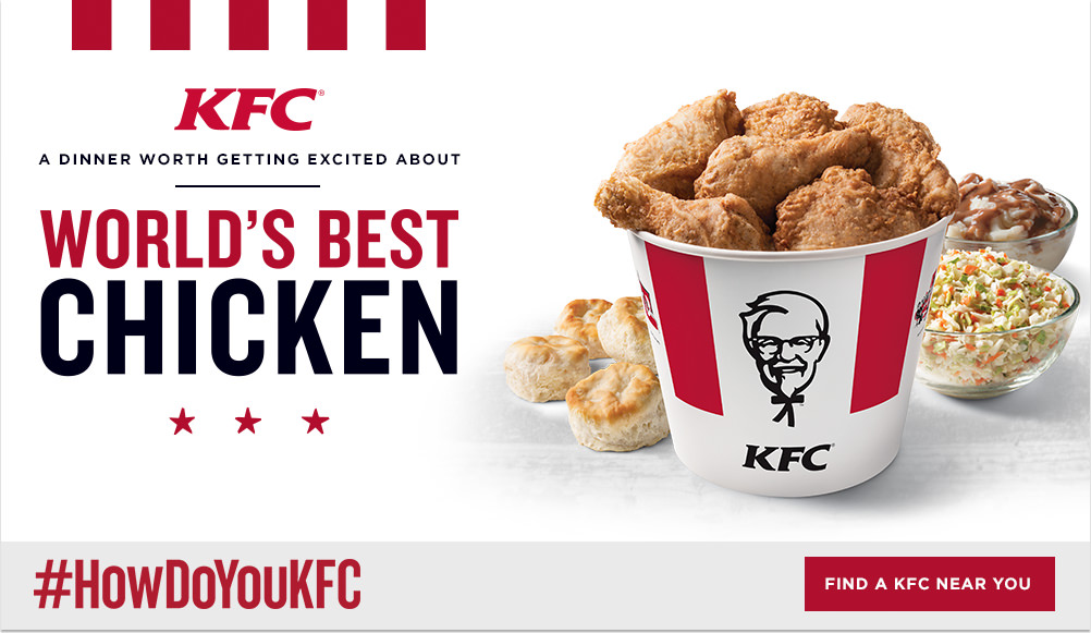
Fast Food should be red, yellow and white. Red to stimulate the appetite, yellow to keep people moving and white for hygiene.
High End Restaurants could use softer versions of orange such as coral, terracotta to encourage social enjoyment. Also deeper red for appetite and green or aubergine for a stylish elegant effect.
Hotels and Bars should consider using green to encourage people to drink more. Combine with orange with encourage interaction and communication.
Entertainment Businesses need colours that are fun and enticing. So think about a bit of yellow for happiness, red for stimulation and orange for social interaction.

What do you think? Do these colours convey the same meaning to you?
Another way you can look at it is to choose colour combinations that convey the message you wish to share with your customers.
Green is stimulating to thirst so businesses which rely on beverage sales should use green. Green also helps staff tolerate a noisy, stressful environment.
Yellow is a happy and playful colour, but it can cause anxiety or concern. So if you want your customer to move through your business quickly then use yellow. Otherwise use yellow in small amounts.
Blue will suggest that you are trustworthy and honest. Blue has a soothing effect on your customers. It will encourage them to stay in your store or site longer. Blue is favoured by many people.
Red should be used in small doses in retail businesses. If can cause aggression. It should be a pop colour to add a wow factor to your brand.
Have you ever used these rules for developing a brand. If so we would love to hear about it.