Your web design is one of the most important aspects of your online business. Everything in your design is important and in this post I’ll be giving you some simple website design tips to help improve your website, ranging from colours, fonts, images, and how all of this relates to your success and failure.
Have a polished, professional logo - and link it to your home page
Your logo is an important piece of your brand. It is the visual representation of your brand so you need to make sure you have a professionally designed logo that best represents your brand identity. A good idea is to feature your logo in the top left hand corner of each of your pages and also link your logo back to your home page for easy navigation.
Use intuitive navigation
This means make sure that you have primary and secondary navigation for your site. You need to make sure that your primary navigation options are deployed at the top of the site and your secondary navigation options are deployed in the form of a sidebar.
This is important to avoid any confusing navigation layout otherwise people are more likely to quit a page than spend time trying to work it out. Put the less important links for your page at the footer of your site rather than in the primary navigation area.
Get rid of clutter
Many websites place too many images on their sites where it gets to the point that visitors become overloaded with information. When this happens they are more likely to leave the site than stay on it.
If you want to keep visitors on your site you need to make sure that there are no competing calls to action on web pages or visual clutter such as an excessive amount of images and graphics. Basically anything that will divert a visitors’ attention away from your main message on the page.
Another great tip is to keep your paragraphs short. People tend to have short attention spans so make sure your paragraphs are no longer than five to six lines.
Give visitors breathing room
It is important to control the white space on your site by creating enough space between your paragraphs and images. This ensures that the reader has room to breathe and absorb all of the features your site and business has to offer. A great rule to remember here is less is more, which will help to keep readers focused on your content.
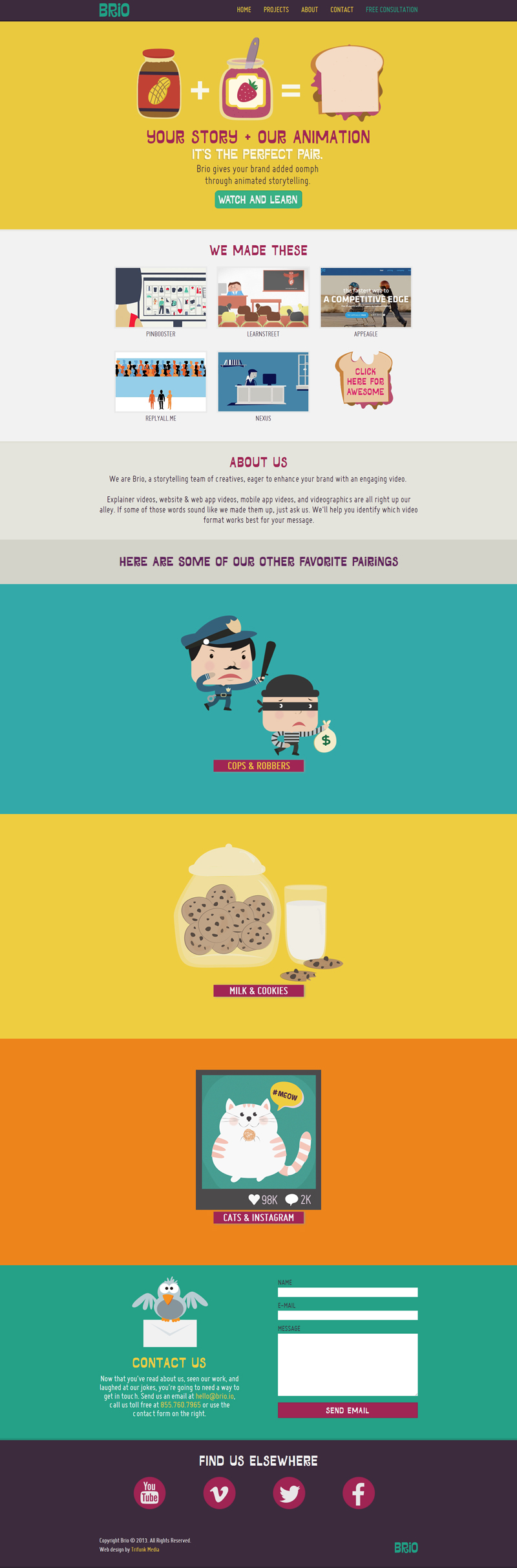
Use colour strategically
The colours on your site should be used strategically. Using a mostly neutral colour palette can help your site project an elegant, clean and modern appearance. For example you could also use small dashes of colour on headlines and key graphics to help guide visitors to your most important pieces of content. You need to remember to keep the colours you use consistent with the rest of your marketing materials though.
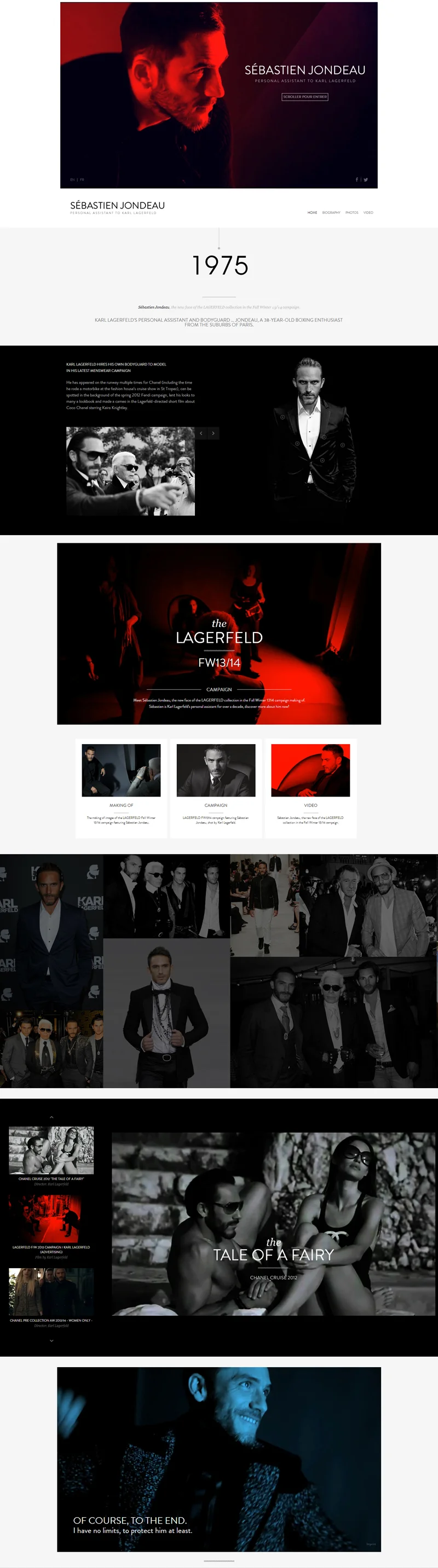
Invest in good, professional photography
Make sure that you invest in professional photography. If you use generic photos then you are creating a generic impression of your site whereas professional photography creates that important positive first impression that you need.
If you can’t afford to invest in professional photography for the time being then at least invest in some professional looking stock photos because this is better than a generic photo that says nothing about your business.
Choose fonts that are easy to read across devices and browsers
Choosing a font is a very important part of the website design process. When choosing a font you need to consider what it will look like on a tablet or mobile device. This is so important now because so many people are using these devices to browse the net with. The problem is that a font that looks good on a computer monitor might not look so good on a smartphone.
The typeface you choose should be easy to read and no less than 11pt in size. If you are using a fixed width design then use a font size that allows for a maximum of 15-20 words per line. If you use a fluid design then use a font size that allows 15-20 words per line at 900-1000 pixels wide.
Design every page as a landing page
You need to design your website so that the key information you want displayed is on every page. This is because the majority of site visits do not begin on the home page. So every page needs to be designed as if it were a landing page with all of the key information being displayed on that page.
Respect the fold
Your call to action should be featured on the upper portion of your website. Put your business phone number and email address at the top of the page (if you want customers to contact you). With regards to home page images it is best to not go for a full width slider. You can still use a slider or some other images, however, it is best that it only covers two-thirds of the width so you can add in a contact form above the fold.
Use responsive design - that automatically adapts to how the site is being viewed
Make sure that you use a website that has a responsive design. This means that it will automatically adapt to the browser size on whatever device you are using. This is much more efficient than designing a site for each device and it also creates a better user experience, which means visitors are more likely to spend more time on your site.
Forget Flash
Forget using Flash. The ongoing dispute between Adobe and Apple has ensured that using Flash as an internet standard is coming to a close. There are other options that are more user friendly such as HTML5. What is so great about HTML5 is that it’s search engine friendly and has the ability to function on many popular mobile operating systems without a plug-in.
Don’t forget about buttons
Buttons are something that can be overlooked but they shouldn’t be. Many of your typical submit or send buttons look ugly so what you should do is aim to make the buttons so appealing to customers that they can’t help but click on it. Ideally, you should design the buttons in mind so that they change colour, gradient, opacity, or even font style when you hover over them.
Test your design
Test your website design so that you can optimise your website. You want to test various elements of your design so you can determine which is best. You can do things like user testing, A/B, and simple analytics to help you determine what is working well and what isn’t. Testing your web design is so important because it can result in more profits for your business when you hit that winning design.
In Conclusion
There are few simple website design tips you can start implementing today. Web design is one of the most important aspects of your business and can help improve your bottom line by enhancing user experience. If you are someone who is not the most savvy when it comes to website design then it may be wise for you to hire a professional so you can create the best looking website possible.