Welcome to 2015. At Boutique Business Consulting we are excited about the new year ahead. We thought we would kick of our first post for 2015 looking at the web design trends we can expect to see in 2015. Web design is always changing but as you will see below there are some tried and true trends that look like they are here to stay.
Clients, especially those with existing websites, often ask me how important is the design of the site really. My answer is always the same. It is important BUT its not important for it to be always the latest new fangle web design. Its important for it be clear to the customer what you are selling and why they should buy from you. So this means the design needs to clean, with great images, nice easily to read typography and it should look professional. All images should be clear and the same size, the site should be well aligned with no distractions to the eye. If you look at these trends below you will see that they follow these conventions. So now onto the trends...
1. Responsive or die
Yes, I know that that sounds a bit dramatic but it is so important that your website is responsive. What does responsive actually mean? It means that as you changes the size of your screen the website will change the layout to accommodate the screensize. A good way to check that a website is responsive is to get your browser window on your desktop and drag the corner to reduce the size. At each point where you drag it, the site should have changed to respond to the screensize. Your website needs to look amazing on a mobile phone and on an iPad. It still surprises me how many sites I go on that still show the desktop version on the mobile.

Last week Shopify announced that for the first time in history that more people used mobile phones and tablets to visit online stores than using desktop computers. They drew this conclusion from looking at data from over 100,000 ecommerce stores that use the Shopify platform, they saw 50.3% of traffic coming from mobile (40.3% from mobile phones, 10% from tablets) and just 49.7% from computers. This is pretty compelling data. So how does your site look on a mobile?

2. Large stunning photos and videos
Having amazing imagery on your website makes your website look amazing. Its plain and simple. Human beings love to look at beautiful photos so if you have beautiful photos on your website potential customers will be attracted to your website and will hang around long enough to have a look. Getting amazing, beautiful photos can be expensive but I always recommend to clients to spend as much as they can afford because these images can give your site the wow factor. Depending on your business, you can find amazing photos on stock websites like Shutterstock and iStock Photo.

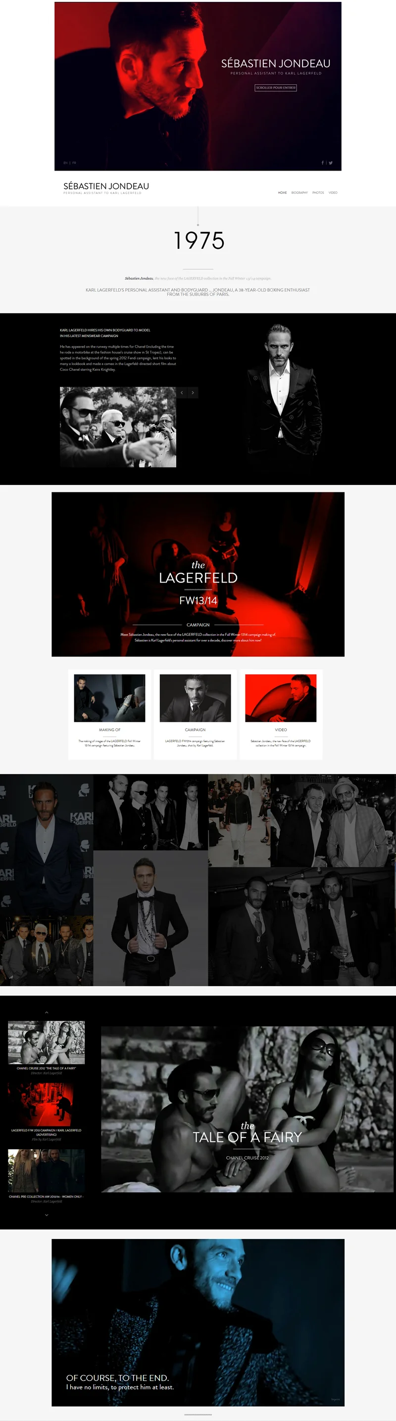
3. Scrolling over Clicking
The rise in the use of tablets and mobile phones has seen us change the way we design. Once upon a time we wanted the site to be above the fold because people wouldn't scroll. Now we have no choice - we have to scroll on tablets and mobiles and so designers are creating longer website where people scroll to see the content instead of clicking to go off to another page.
This has seen the rise in 2014 of the one page website (all content is found on the homepage). These website are actually just one long page. When the user clicks on the item in the menu - that are taken down to the relevant part of the page. These sites accommodate both scrolling and clicking and can be very effective for content based businesses to tell their story on one page. Here is an example below:

4. Growth in Flat Design
We saw the growth of flat design in 2014 and it will continue into 2015. CreativeBloq.com defines flat design as a minimalistic design approach that emphasizes usability. It features clean, open space, crisp edges, bright colours and two-dimensional/flat illustrations. I.e. no flashy illustrations and animations and no real life realities like textures drop shadows etc. The Windows 8 desktop is an example of this:

5. Masonry (Cards and Tiles) are here to stay
This is one of my favourite trends in Web Design. Thanks to Pinterest we have seen the increase of Cards and Tiles within Web Design. When it comes to a layout of a blog roll we often use the masonry layout to achieve this effect. A number of Shopify themes now use this kind of layout in their designs. The Testament theme uses it in for the blog roll and the Altron for the collection page layout. Here is an example below:

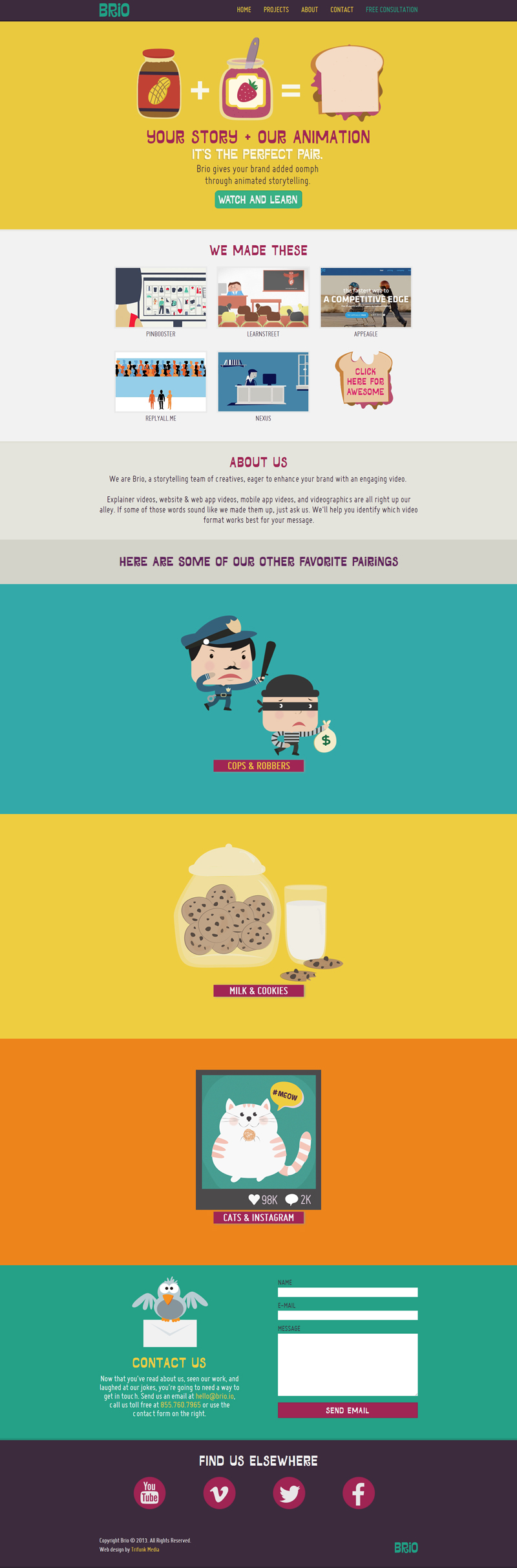
6. One wow colour
This design aesthetic uses one dominant colour in the design. In the example below - yellow is the wow colour in this flat, simple yet very effective design.

7. Video Backgrounds
I think you either love or hate this one. Video backgrounds can be very cool but they can also be very irritating if not implemented correctly. Here is a groovy one by Uniqlo in Japan.

8. Unique Navigation
There has been a rise in unique navigation (main menus) on websites. It can add a differentiation to your website user experience. This is one design trend I am not sure about. I think its ok to have a unique way of navigating your site as long as its still VERY obvious to the user how they navigate. The last thing you want is for a user to have no idea how to find what they are looking for.
Here is an example of unique navigation implemented well. The user doesn't have to spend long thinking about where they should click to find out more information.

9. Outline Buttons
For a long time buttons in website design have been solid usually with a strong call to action colour like read or green. In more recent times we have seen an increase in buttons that are outlines only. I personally love the look of these buttons. See an example below.

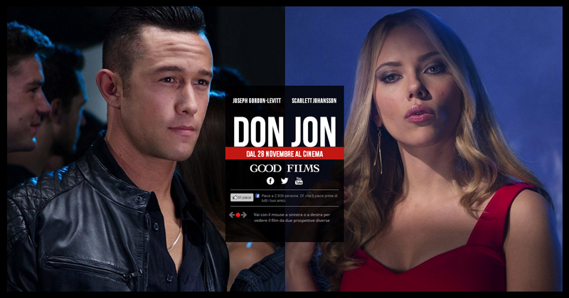
10. Big, Awesome Typography
I love fonts, I love looking for fonts and seeing how they can make or break a design. There are so many awesome fonts available today and many of them can be added to your website for free or a small fee. Typography can set the tone and even mood of the website. Here is a great example of typography used well on a website - its big and bold and makes a statement. It seems so simple yet you can't argue that it is effective.

I personally love where web design is headed for the moment. If you are looking for more design inspiration, Shopify recently put together this list of 30 beautiful designs. Enjoy!